|
After you have unzipped,
open textise01.gif |
| |
|
 |
Colors || Increase Color
Depth || 16 Million Colors
Go to Layers || Duplicate
(This will give you a Copy of Background in your layers palette)
In your layers palette,
make the Background layer active
|
| |
|
|
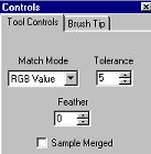
Select the magic wand
-
Settings:
-
Match Mode = RGB Value
-
Tolerance = 5
-
Feather = 0
-
ample Merged = Unchecked
|
| |
|
 |
Select the pale turquoise
blue at the top of the image.
You will need to zoom
in close to select all the turquoise.
Remember to hold Shift
key while selecting all other areas. Be sure to get ALL the areas.
|
| |
|
|
The object is to darken
or lighten the area a bit (whichever you choose)
-
For this session, these are
the settings I used:
-
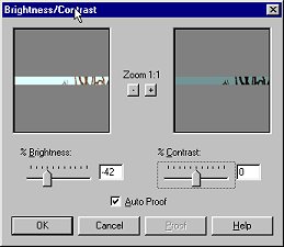
Colors || Adjust || Brightness/Contrast
-
Brightness = -42
-
Contrast = 0
-
lick OK
|
| |
|
 
|
In your layers palette,
activate Copy of Background
Select your eraser tool 
These settings may be
changed to suit your personal preferrence
-
Settings I used:
-
Paper Texture = Lava
-
Shape = Square
-
Size = 50
-
Opacity, Density, Hardness
= 65
-
Step = 40
|
| |
|
|
Drag your eraser tool
over the selected area.
You can make it as heavy
or light as you like.
DESELECT
|
| |
|
 |
In your layers palette,
make the Background layer active
Using the same Magic
Wand settings as before:
Select the pale blue
under the turquoise at the top of the image.
Just a reminder:
You will need to zoom
in close to select all the blue. Remember to hold Shift key while selecting
all other areas. Be sure to get ALL the areas.
|
| |
|

|
The object is to darken
or lighten the area a bit (whichever you choose)
-
Settings I used:
-
Colors || Adjust || Brightness/Contrast
-
Brightness = -26
-
Contrast = 24
-
lick OK
|
| |
|
 
|
In your layers palette,
activate Copy of Background.
Select your eraser tool
These settings may be
changed to suit your personal preferrence.
-
Settings I used:
-
Paper Texture = Clouds
-
Shape = Square
-
Size = 30
-
Opacity, Density, Hardness
= 65
-
Step = 40
Drag your eraser tool over
the selected area. You can make it as heavy or light as you like.
DESELECT
|
| |
|

|
We are going to repeat
these steps until the complete image has been texurized.
Remember if you accidently
select a section you don't want, use the Undo function. Also, if you missed
a little section above where you are you can select that and include it
with the section underneath it.
|
| |
|
 |
You can if you like instead:
Select the complete image
Go to Colors || Adjust
|| Brightness and Contrast and then select each separate section you wish
to change the texture of.
I like doing it individually
as you have more control of the darkness and brightness of each section.
Be
sure your Background layer is the active layer when you adjust the brightness
and contrast, and be sure your Copy of Background is the active layer when
you use the eraser tool.
If
not, you will find yourself doing extra work. ;o)
|
| |
|
|
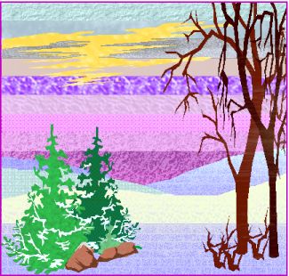
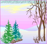
In case you would like
your finished image to look like the one at the top of this page, and also
to show you that more than just Brightness/Contrast can be changed I have
added the settings I've used for each section.
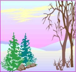
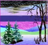
Shown is another copy
of the image using different settings.
BUT, the settings below
are for the image at the top of this tutorial. ;o)
|
| |
|
 
|
I selected the yellow
using the magic wand
Instead of changing Brightness/Contrast
-
Colors || Adjust || Hue/Saturation/Lightness
-
Hue = 100
-
Saturation = 100
-
Lightness = -47
-
Paper Texture = Lunar
I selected the next blue
|
| |
|
|
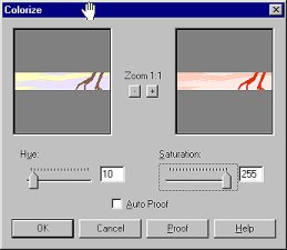
I selected the uppermost
lavendar layer
-
Clicked on Colors || Colorize
-
Set Hue to 10
-
Saturation to 255
-
I changed to a larger brush
-- Size 90
-
Changed the Opacity and Density
to 100
-
Used Fog Texture
I went over it several times
with the Eraser Brush and again made the Background layer active
The next settings are
not pictured, BUT are done on this same layer
No need to use Eraser Brush
as it changes on its own.
|
| |
|
 |
I selected the next lower
lavendar layer
-
Colors || Adjust || Highlight/Midtone/Shadow
-
Highlight = 100
-
Midtone = 100
-
Shadow = 85
-
Texture = Marble
|
| |
|
 
|
By now I'm sure you know
the settings are found under Colors, so I'm not going to list that
Next lavendar
-
Brightness = -28
-
Contrast = 29
-
Texture = Fruit Peel
Next lavendar
|
| |
|
 
|
Next lavendar
-
Brightness = -35
-
Contrast = 29
-
Changed Opacity to 60 Density
to 40
-
Texture = Asphalt
Lowest 2 lavendars
|
| |
|
 
|
Remaining light blues
-
I changed Tolerance several
times
-
Hue = 100
-
Saturation = 100
-
Lightness = -29
-
Changed Brush Size to 130
-
Opacity = 60
-
Density = 40
-
Used Medium Brick Texture
lightly
Lower Turquoise
|
| |
|
 |
Remaining white
-
Hue = 55
-
Saturation = 255
-
Opacity & Density = 100
-
Texture = Sidewalk
Green Tree on left
Darker Green Tree (Settings
are the ones pictured)
|
| |
|
|
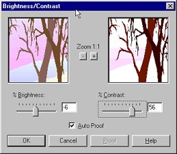
The Rocks
-
Hue = 10
-
Saturation = 130
-
Texture = Sidewalk
The trees (Settings are the
ones pictured)
-
Brightness = -6
-
Contrast = 56
-
Texture = Woodgrain
That's it folks! Hope
you enjoyed it and find it useful for texturizing your images, thereby
giving them a new look. ;o)
|
| |
|