|
(Prof's PSPv7 Effects and Techniques) > Lights Effect |
||
|
||
|
The Effects || Illumination Effects || Lights is a most interesting and challenging PSP Effect. It has exceptionally fine options that allow for a creation of lighting effects on an image or in its own right that is a way to enhance and/or create some fantastic images. In this lesson we will only explore how to use the Lights effect so that one has an understanding of its various options. Once you understand how these options create lighting effects, you will have a PSP tool that can be used in most creative ways on any image of your choosing. We will first create a background image using a very dark color for each of the six basic colors (Red, Yellow, Green, Cyan, Blue, and Purple). Then we will explore how each of the Light Options affect these background colors. One very important point is that the Light Effect will not work on a Black or White color. It requires other colors which it enhances with light/dark effects. |
||
|
|
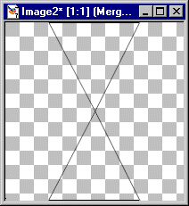
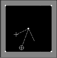
Basic Image Set UpWe will first draw a triangle shape which will divide the basic canvas into six triangular pieces. Each of the triangles will be colored in a dark color.
CANVAS: |
|
|
DRAW TRIANGLESNOTE: Exactness is not necessary, just set the basic areas.
1. Use the PreSet Shapes: 3. Move the triangle so that its horizontal bottom will be at the bottom of your canvas and centered. It's apex (top of triangle) will be in center of your canvas. TIP: An easy way to move the object is to click on the deformation tool and then use the SHIFT Key with the ARROW keys to move it to a location and then click on APPLY in the Tools Options Window. 4. Copy it [ctrl+C] and Paste it as a New Layer [ctrl+L]. 5. Use Image || Flip. Then move it so the apex touches the apex of the first image and its horizontal edge is at the top of the canvas. |
|
|
6. Now Create a New Layer and then draw a straight line from the left side to the right side intersecting the apex of the two triangles.
TIP: Use the Draw Tool: Widen your canvas by putting mouse button on a corner and open up canvas some. You will have an easier time getting the vertical and horizontal coordinates to draw the line through the apex of the triangles. Draw the line around Horizontal 200 from left to right. Extend the line beyond one side of the canvas. Then use: Objects || Align || Center on Canvas Finally, convert the Layer to a Raster Layer At this point you have six areas outlined by black lines. Use: Layers || Merge Visible |
|

|
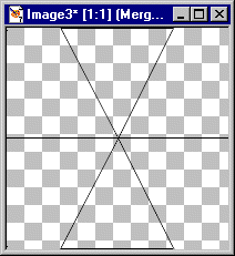
Color The Triangles:1. Basic Steps for each Triangle.
a. Use: Magic Wand. d. Set the Foreground Color from the color wheel with These Values for each Triangle starting with upper left triangle and moving clockwise.
1. R = 32, G = 0, B = 0 e. Flood fill each Triangle. 2. Your canvas should appear as if it is black. (However, the basic colors are there as we will find out when we explore the Light Effect. 3. Since you may want to use this background for other exploration, DUPLICATE the layer and work with the COPY Layer. |
|
|
|
Exploring Illumination || LightsLet's explore how the LIGHT Effect works.STEP 1. Use: Effects || Illumination Effects || Lights At this point, you will see the Last Used Effect. Not knowing which Last Used Effect is being displayed, your will see some type of lighting effect and it will display the six basic colors in some fashion. However, we will create our own outcome by exploring the Light Options. |
|
|
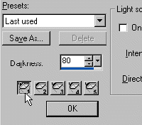
A. In the Lights Window, bottom left corner above the OK button, are 5 'lights' buttons numbered 1 - 5. 1. Click on each button. Then in the light source area if the ON box is check, UNCHECKED it. When you have turned off all 5 lights, your canvas again will be black. NOTE: Do NOT click on the OK button until we have finished this exploration. |
|
|
2. Notice at the top there are Two Boxes, both currently displaying a black canvas. In the Left Box, your Lights will be displayed as a White Dot and one of them may have some symbols. If you do not see 5 white dots, do not panic as one or some of them may be off the left box canvas area. We will find them in a bit. |
|
|
3. We will first position the lights, one in each corner and one in the center. It does not really matter which light is positioned where. However, for our purposes, we will position the lights as follows:
Light 1 = Lower Left Corner There are two ways to move a light.
a) One is to set the Horizontal and Vertical coordinates.
1) Lower Left --- (1):
2) Upper Left --- (2):
3) Upper Right -- (3):
4) Lower Right -- (4):
5) Center Light - (5): NOTE: By setting the Horizontal (-100 to +100) and the Vertical (-100 to +100) you can position the light (source) anywhere on the canvas. |
|
|
|
B. Exploring the other Options starting with Light 5 (Center)
1. Click on Light 5 to activate it (the Center Light)
Color = White NOTE: Your canvas is Black. 4. In the Left Black Box note that the white dot has a Circle with an X in it, two straight lines pointing up with a Cross Hatch. |
|
|
|
THE ASYMMETRY OPTION: Currently it is 1. Set it to 1000. Note that the Circle with the X in it now has disappeared at the top of the Light Box. If you place your cursor on the Down Arrow in the Asymmetry box, hold cursor and drag it left you can change the asymmetry from 1000 to 1. Note also that you can place your mouse cursor on the Circle with the X, hold mouse button down and drag it up or even drag it around in a circle. Dragging it out away from the light source (white dot) changes the asymmetry value. Dragging it around in a circle changes the Horizontal and Vertical Settings. |
|
|
|
THE CONE SIZE OPTION: Currently set to 1. Set it to 89. Note: The value of 89 is the maximum cone shape possible. Again, either click on the down arrow and drag to change it's value or click on the Cross Hairs and drag them together or apart to change the value. Return both Cone Size and Asymmetry to value = 1 |
|
 |
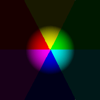
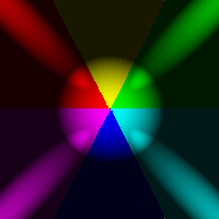
5. Exploring Intensity, Scale, Darkness, and Smoothness: Set both Intensity and Scale to a value = 100 You now have a circle in the center of your canvas with triangular colors (the six colors we set). |
|
|
|
THE SCALE OPTION: Vary it from 100 to 0 to see how the size of the colored circle changes from its current size to a black screen.
THE INTENSITY OPTION:
THE DARKNESS OPTIONS:
THE SMOOTHNESS OPTION: |
|
 |
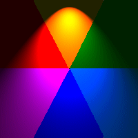
6. Creating a Beach Ball Use these values:
Scale = 100 Note how the shadowing creates a 3D beach ball effect. Now, just play with these 4 values a bit to get an idea of other effects. When done playing just return to the above values. |
|
  
|
7. Exploring the Asymmetry Option: To understand what the Asymmetry Option does, just vary the values to 1000. Start at 1000 and then decrease it ultimately back to 0. Then set Asymmetry back to 1000. Change the Direction from 0 to 90. Note now you have a vertical rather than a horizontal effect. By varying the direction, you can get the light to point to any direction on the circumference of a circle. Although it is subtle the right side of the vertical is more blurred than the left side. If you change the direction to 315 (pointing left and up) the left side is more blurred than the right side. |
|

|
C. How the Options work together and create effects. In this exercise we will explore how the options work together. Changing one option will have an effect on some or all the other options.
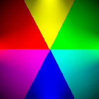
1. Start with these Values: a) Start with Cone Size: Click on the up arrow to change the value by 1. Notice that the ball increases in size. Change cone value again by 1. (now 3). Notice that the ball shape is now almost the full screen. Change cone value once again now to 4. Notice that the ball shape again has increased. Now, Change the Scale to 50. Note that by increasing Cone Size the Focus or spread of the light effect increases while decreasing the Scale reduces the spread size. |
|
   Playing with all options. |
b) Exploring how Asymmetry interacts with Scale and
Cone Size. Now, lets play with the Asymmetry value. First, set it to 1000. Notice how the light effect goes up to the top and blurs out in the yellow while the blue is still more intense. If you now increase Cone Size and/or Scale you increase the size of the effect. Try it, first increasing cone size. With just these three options you can create some very interesting effects. Then try decreasing the Asymmetry value by 200. You again can change the light effect. It has (though colored) the effect of a flash light or a lamp. Set the direction to 180 for a lamp effect that is colored. Now, if you play with the Colors, you will find out that certain colors will mask out other colors and enhance others. Try it. Finally, play a bit with the Darkness value and note how it lowers the intensity or darkens the effect. Playing with the Intensity and Darkness together you can create some very subtle lighting effects as well. You now should have some idea of how these options for a particular light create interesting effects. The best teacher now is to explore and create and see how different settings for lights can create different outcomes. The following are two effects for you to play with. |
|
|
Two Examples1. A Colored Star Effect
a. Center Light (5) On
b. Bottom Center (1) On
c. Left Center (2) On
d. Top Center (3) On
e. Right Center (4) On To Save: Click on the SAVE AS button and name it. My-Star |
|
|
Two Examples2. A Colored Ball Effect
a. Center Light (5) On
b. Bottom Center (1) On
c. Left Center (2) On
d. Top Center (3) On
e. Right Center (4) On To Save: Click on the SAVE AS button and name it. My-Ball Have Fun! -- Prof -- |
|
